This is the legacy 4D documentation web site. Documentations are progressively being moved to developer.4d.com
 Widgets

Adds a calendar associated with an assignable expression, such as a date variable or property (Form.myDate). The calendar can be configured in order to specify holidays, a date span, and so on.
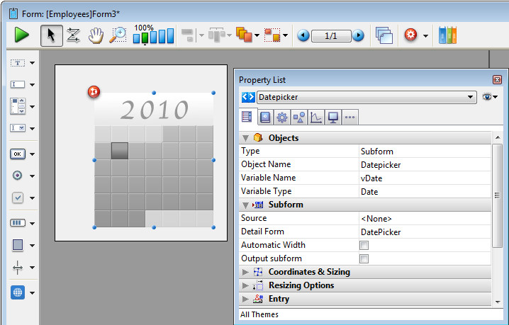
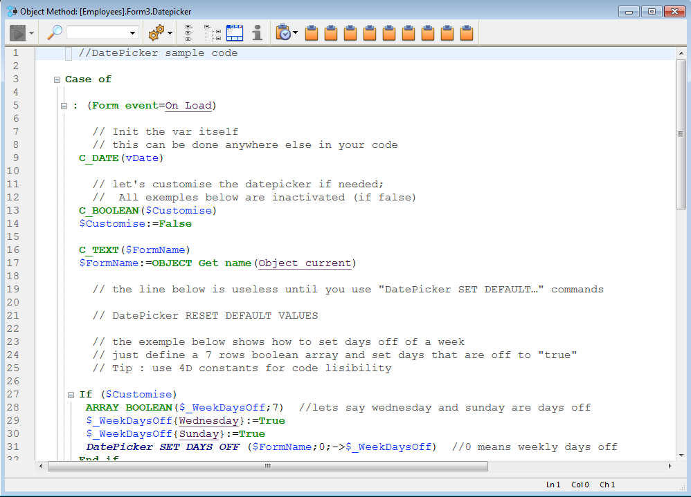
Sample code is provided in its object method. You can configure it using the commands provided for the Date picker widget.
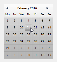
Here is the calendar as it appears in the form:
For more information about DatePicker widget commands, refer to DatePicker.
Note: The Date picker, Pop-up Date and Date entry objects all share the same datasource by default and will display matching dates when used on the same form.

Adds a pop-up area used to display a calendar for selecting dates. Dates selected are assigned directly to the Date expression associated with this area.
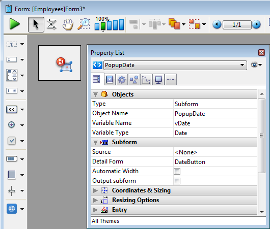
Sample code is provided in its object method. You can configure it using the commands provided for the Date picker widget.
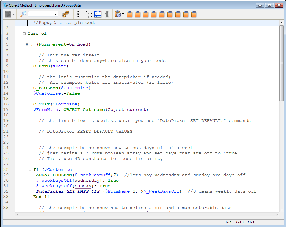
Here is how it appears in the form:

For more information about DatePicker widget commands, refer to DatePicker.
Note: The Date picker, Pop-up Date and Date entry objects all share the same datasource by default and will display matching dates when used on the same form.

Adds a data entry area with three separate fields for entering the day, month and year, respectively. You can also configure it to specify an enterable span of dates.
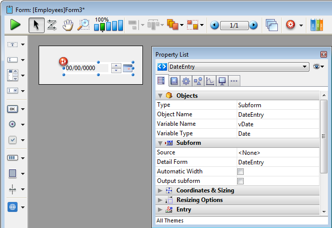
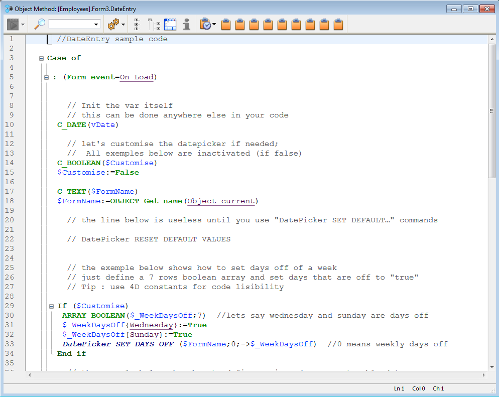
Sample code is provided in its object method. You can configure it using the commands provided for the Date picker widget.
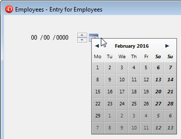
Here is a date entry area when the form is in use:
For more information about DatePicker widget commands, refer to DatePicker.
Note: Initially, the Date picker, Pop-up Date and Date entry objects all share the same Date variable and will display matching dates when used on the same form.


Adds a pop-up area used to enter a time. You can configure min and max values as well as the intervals used.
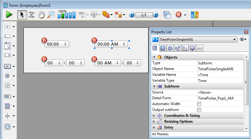
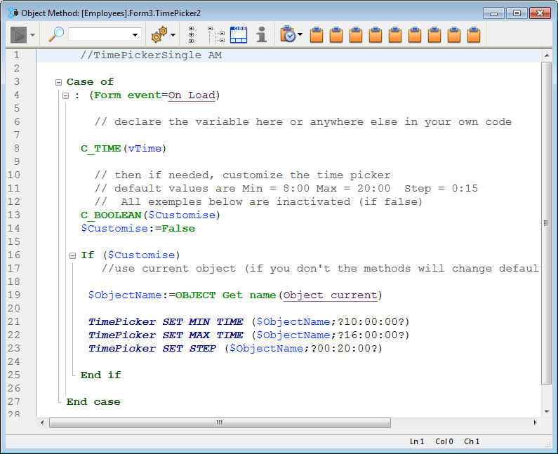
Sample code is provided in its object method. You can configure it using the commands provided for the Time picker widget.
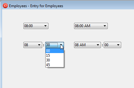
Here are the different time pickers available in a form:
For more information about TimePicker widget commands, refer to TimePicker.


Adds a time entry area with three separate fields for entering the hour, minute and second, respectively. You can also configure it to specify an enterable span of times.

Sample code is provided in its object method. You can configure it using the commands provided for the Time picker widget.
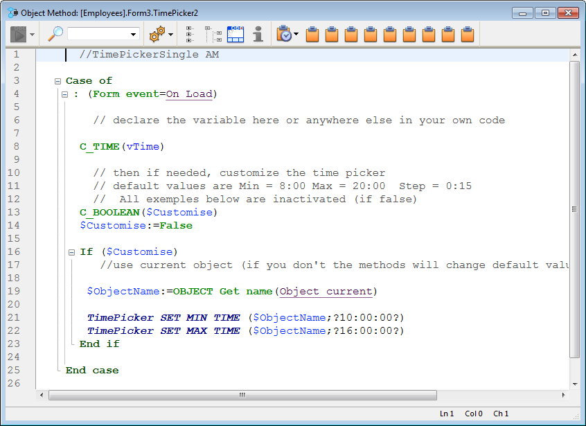
Here are the time entry areas available in a form:
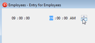
For more information about TimePicker widget commands, refer to TimePicker.


Adds a time display area (clock or LCD) which can display a static time or a functioning clock, depending on the type of associated variable or expression.
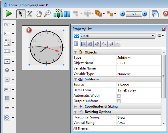
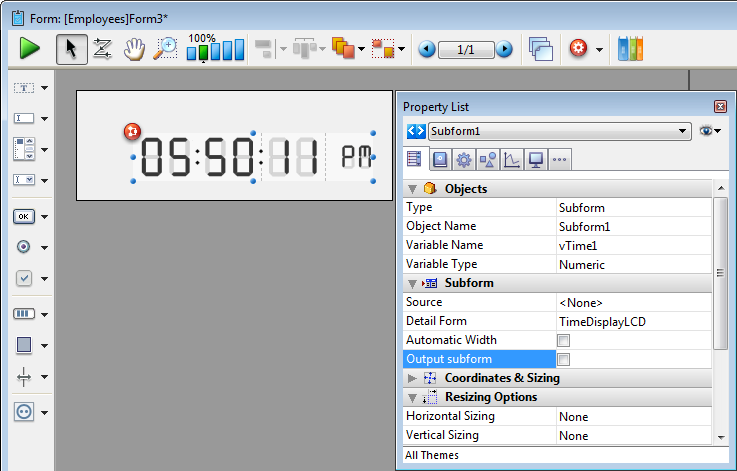
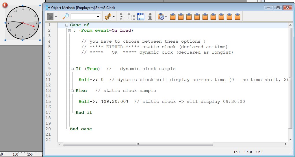
Sample code is provided in each object method to demonstrate different display options. You can also configure it using the commands provided for the Time picker widget.
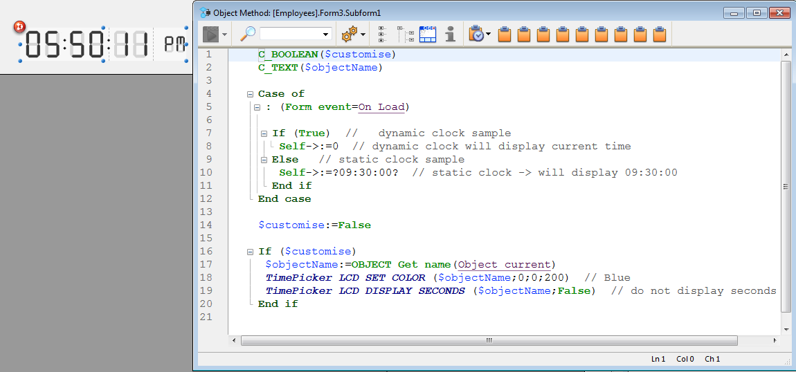
Static clock
To display a static object that indicates a specific time, select the appropriate type for its bound variable or expression and give it a value in the object method:
- for a variable, select the Time or Text type and assign it a time or text value in the object method. Ex: vTime:= ?10:15:30? or vTime:= "10:15:30"
- for an expression such as "Form.myTime", select the Text type, and assign it a text value in the object method. Ex: Form.myTime := "13:20:30"
Dynamic clock
To display a dynamic time:
- for a variable, declare the variable as a Longint. When you set it to 0 (ex: vTime:=0), the clock or LCD displays the current time.
- for an expression, assign the expression with a Longint or Time value. When you set it to 0 (ex: Form.myTime:=0 or Form.myTime:=?00:00:00?), the clock or LCD displays the current time.
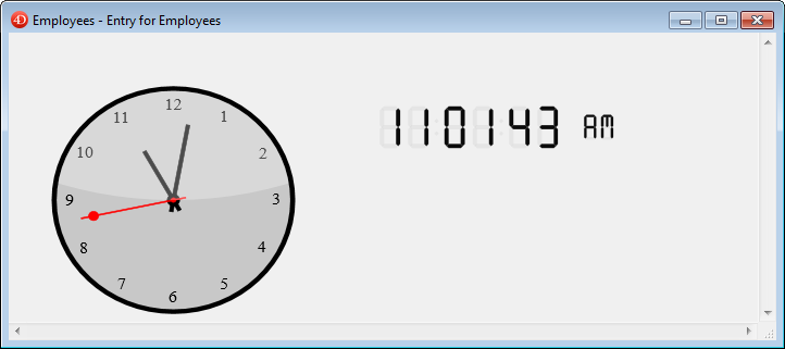
You can set other values (positive or negative) in order to shift the time displayed accordingly. This value is expressed in seconds, so passing “3600” shifts the time displayed ahead one hour, for example, and passing “-1800” shifts the time displayed back by a half hour.
For more information about TimePicker widget commands, refer to TimePicker.
Product: 4D
Theme: Library objects
4D Design Reference ( 4D v20 R7)

 Overview and Summary table


