
This is the legacy 4D documentation web site. Documentations are progressively being moved to developer.4d.com
- 4D Language Reference
-
- List Box
-
-
 Managing List Box Objects
-
List Box Commands Summary
-
 LISTBOX COLLAPSE
-
LISTBOX DELETE COLUMN
-
LISTBOX DELETE ROWS
-
LISTBOX DUPLICATE COLUMN
-
LISTBOX EXPAND
-
LISTBOX Get array
-
LISTBOX GET ARRAYS
-
LISTBOX Get auto row height
-
LISTBOX GET CELL COORDINATES
-
LISTBOX GET CELL POSITION
-
LISTBOX Get column formula
-
LISTBOX Get column width
-
LISTBOX Get footer calculation
-
LISTBOX Get footers height
-
LISTBOX GET GRID
-
LISTBOX GET GRID COLORS
-
LISTBOX Get headers height
-
LISTBOX GET HIERARCHY
-
LISTBOX Get locked columns
-
LISTBOX Get number of columns
-
LISTBOX Get number of rows
-
LISTBOX GET OBJECTS
-
LISTBOX GET PRINT INFORMATION
-
LISTBOX Get property
-
LISTBOX Get row color
-
LISTBOX Get row color as number
-
LISTBOX Get row font style
-
LISTBOX Get row height
-
LISTBOX Get rows height
-
LISTBOX Get static columns
-
LISTBOX GET TABLE SOURCE
-
LISTBOX INSERT COLUMN
-
LISTBOX INSERT COLUMN FORMULA
-
LISTBOX INSERT ROWS
-
LISTBOX MOVE COLUMN
-
LISTBOX MOVED COLUMN NUMBER
-
LISTBOX MOVED ROW NUMBER
-
LISTBOX SELECT BREAK
-
LISTBOX SELECT ROW
-
LISTBOX SELECT ROWS
-
LISTBOX SET ARRAY
-
LISTBOX SET AUTO ROW HEIGHT
-
LISTBOX SET COLUMN FORMULA
-
LISTBOX SET COLUMN WIDTH
-
LISTBOX SET FOOTER CALCULATION
-
LISTBOX SET FOOTERS HEIGHT
-
LISTBOX SET GRID
-
LISTBOX SET GRID COLOR
-
LISTBOX SET HEADERS HEIGHT
-
LISTBOX SET HIERARCHY
-
LISTBOX SET LOCKED COLUMNS
-
LISTBOX SET PROPERTY
-
LISTBOX SET ROW COLOR
-
LISTBOX SET ROW FONT STYLE
-
LISTBOX SET ROW HEIGHT
-
LISTBOX SET ROWS HEIGHT
-
LISTBOX SET STATIC COLUMNS
-
LISTBOX SET TABLE SOURCE
-
LISTBOX SORT COLUMNS
-
Managing List Box Objects
The commands of this theme are dedicated to handling form objects of the List box type.
List boxes represent data in the form of columns and selectable rows and provide many interface functions such as the ability to enter values, sort columns, display a hierarchy, define alternating colors, and so on.
You can completely set up a list box in the 4D Form editor and can also manage it through programming. For more information on creating and setting List boxes in the Form editor as well as on their use, refer to the Design Reference manual of the 4D documentation.
Programming list box objects is done in the same way as other 4D list form objects. However, specific rules must be followed, as detailed in this section.
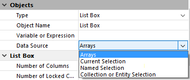
A list box can contain one or more columns and can be associated either with 4D arrays, a selection of records, a collection or an entity selection. In the case of selection and collection/entity selection type list boxes, columns are associated with expressions (in selection type list boxes, columns can also be directly associated with fields).
It is not possible to have multiple types of data sources (arrays, selections, collections or entity selections) combined in the same list box. The data source is set when the list box is created in the Form editor, via the Property list. It is then no longer possible to modify it by programming.
In this type of list box, each column must be associated with a one-dimensional 4D array; all array types can be used, with the exception of pointer arrays. The display format for each column can be defined in the Form editor or by using the OBJECT SET FORMAT command.
Using the language, the values of columns (data entry and display) are managed using high-level List box commands (such as LISTBOX INSERT ROWS or LISTBOX DELETE ROWS) as well as array manipulation commands.
For example, to initialize the contents of a column, you can use the following instruction:
ARRAY TEXT(ColumnName;size)You can also use a list:
LIST TO ARRAY("ListName";ColumnName)Warning: When a list box contains several columns of different sizes, only the number of items of the smallest array (column) will be displayed. You should make sure that each array has the same number of elements as the others. Also, if a list box column is empty (this occurs when the associated array was not correctly declared or sized using the language), the list box displays nothing.
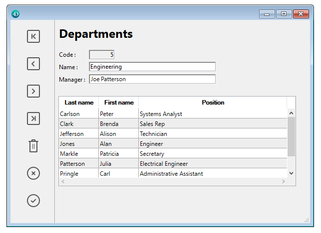
In this type of list box, each column can be associated with a field or an expression. The contents of each row is then evaluated according to a selection of records: the current selection of a table or a named selection.
When the current selection is the data source, any modifications made on the database side are automatically carried over to the list box and vice versa. The current selection is thus always the same in both locations.
Note: The LISTBOX INSERT ROWS and LISTBOX DELETE ROWS commands cannot be used with selection type list boxes.
You can associate a list box column with an expression. The expression could be based on one or more fields (for example [Employees]LastName+“ ”+[Employees]FirstName) or simply be a formula (for example String(Milliseconds)). The expression can also be a project method, a variable or an array element.
The LISTBOX SET TABLE SOURCE command can be used to modify the table associated with the list box by programming.
In this type of list box, each column must be associated to an expression. The contents of each row is then evaluated per collection element or per entity of the entity selection.
Each element of the collection or each entity is available as an object that can be accessed through the This command.
A column expression can be a project method, a variable, or any formula, accessing each entity or collection element object through This, for example This.<propertyPath> (or This.value in case of a collection of scalar values). You can use the LISTBOX SET COLUMN FORMULA and LISTBOX INSERT COLUMN FORMULA commands to modify columns programmatically.
When the data source is an entity selection, any modifications made on the list box side are automatically saved in the database. On the other hand, modifications made on the database side are visible in the list box after touched entities have been reloaded.
When the data source is a collection, any modifications made in the list box values are reflected in the collection. On the other hand, if modifications are done on the collection using for example the various methods of the Collections theme, you will need to explicitely notify 4D by reassigning the collection variable to itself, so that the list box contents is refreshed. For example:
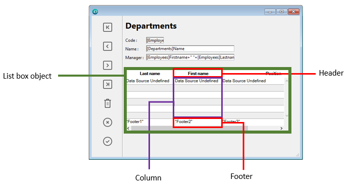
myCol:=myCol.push("new value") //display new value in list boxA List box object is composed of four separate items:
- the object itself,
- the columns,
- the column headers (can be displayed or hidden, displayed by default),
- the column footers (can be displayed or hidden, hidden by default).
These items can be selected individually in the Form editor. Each one has its own object and variable name and can be handled separately.
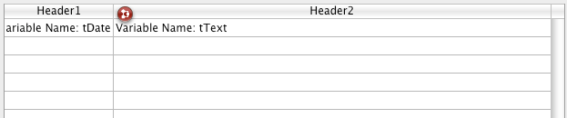
By default, columns are named Column1 to n, headers Header1 to n and footers Footer1 to n in the form, independently of the list box objects. Note that, by default, the same name is used for the objects and their associated variables, except in the case of footers (by default, footer variables are blank; 4D uses dynamic variables).
Each item type contains individual and shared characteristics with other items. For example, character fonts can be globally assigned to the list box object or separately to columns, headers and/or footers. On the other hand, entry properties can only be defined for columns.
These rules apply to the “Object Properties” theme commands that can be used with list boxes. Depending on its functionality, each command can be used with the list box, columns, column headers and/or footers. To set the type of item on which you want to work, simply pass the object name or the variable associated with it.
The following table details the scope of each command of the “Object Properties” theme that can be used with list boxes:
| Object Properties commands | Object | Columns | Column headers | Column footers |
| OBJECT MOVE | X | |||
| OBJECT GET COORDINATES | X | X | X | X |
| OBJECT SET RESIZING OPTIONS | X | |||
| OBJECT GET RESIZING OPTIONS | X | |||
| OBJECT GET BEST SIZE | X | |||
| OBJECT SET FILTER | X | |||
| OBJECT SET FORMAT | X | X | X | |
| OBJECT SET ENTERABLE | X | |||
| OBJECT SET LIST BY NAME | X | |||
| OBJECT SET TITLE | X | |||
| _o_OBJECT SET COLOR | X | X | X | X |
| OBJECT SET RGB COLORS | X | X | X | X |
| OBJECT SET FONT | X | X | X | X |
| OBJECT SET FONT SIZE | X | X | X | X |
| OBJECT SET FONT STYLE | X | X | X | X |
| OBJECT SET HORIZONTAL ALIGNMENT | X | X | X | X |
| OBJECT Get horizontal alignment | X | X | X | X |
| OBJECT SET VERTICAL ALIGNMENT | X | X | X | X |
| OBJECT Get vertical alignment | X | X | X | X |
| OBJECT SET VISIBLE | X | X | X | X |
| OBJECT SET SCROLLBAR | X | |||
| OBJECT SET SCROLL POSITION | X | |||
| OBJECT SET HELP TIP | X | X | X | |
| OBJECT Get help tip | X | X | X |
Note: With array type list boxes, it is possible to specify the style, font color, background color and visibility of each row separately. This is managed via arrays associated with the list box in the Property List. You can retrieve the names of these arrays by programming using the LISTBOX GET ARRAYS command.
It is possible to add an object method to the list box object and/or to each column of the list box. Object methods are called in the following order:
1. Object method of each column
2. Object method of the list box
The column object method gets events that occur in its header and footer.
When the OBJECT SET VISIBLE command is used with a header or footer, it is used on all List box object headers or footers, regardless of the individual element set by the command. For example, the OBJECT SET VISIBLE(*;"header3";False) instruction will hide all headers in the List box object to which header3 belongs and not simply this header.
Note that in order for you to be able to manage the visibility of these objects using the OBJECT SET VISIBLE command, they must have been displayed in the list box at the level of the Form editor (the Display Headers and/or Display Footers option must be checked for the object).
The OBJECT Get pointer function used with the Object with focus or Object current constant (formerly the Focus object and Self functions) can be used in the object method of a list box or a list box column. They return a pointer to the list box, the list box column(1) or the header variable depending on the type of form event. The following table details this functioning:
| Event | Object with focus | Object current |
| On Clicked | list box | column |
| On Double Clicked | list box | column |
| On Before Keystroke | column | column |
| On After Keystroke | column | column |
| On After Edit | column | column |
| On Getting Focus | column or list box (*) | column or list box (*) |
| On Losing Focus | column or list box (*) | column or list box (*) |
| On Drop | list box source | list box (*) |
| On Drag Over | list box source | list box (*) |
| On Begin Drag Over | list box | list box (*) |
| On Mouse Enter | list box (**) | list box (**) |
| On Mouse Move | list box (**) | list box (**) |
| On Mouse Leave | list box (**) | list box (**) |
| On Data Change | column | column |
| On Selection Change | list box (**) | list box (**) |
| On Before Data Entry | column | column |
| On Column Moved | list box | column |
| On Row Moved | list box | list box |
| On Column Resize | list box | column |
| On Open Detail | Nil | list box (**) |
| On Close Detail | Nil | list box (**) |
| On Header Click | list box | header |
| On Footer Click | list box | footer |
| On After Sort | list box | header |
(*) When the focus is modified within a list box, a pointer to the column is returned. When the focus is modified at the overall form level, a pointer to the list box is returned. In the context of a column object method, a pointer to the column is returned.
(**) Not executed in the context of a column object method.
(1) When a pointer to a column is returned, the object pointed to depends on the type of list box. With an array type list box, the OBJECT Get pointer function (“User Interface” theme) returns a pointer to the column of the list box with the focus (i.e. to an array). The 4D pointer mechanism allows you to see the item number of the modified array. For example, supposing a user modified the 5th line of the column col2:
 $Column:=OBJECT Get pointer(Object with focus)

  ` $Column contains a pointer to col2

 $Row:=$Column-> `$Row equals 5
For a selection type list box, the OBJECT Get pointer function returns:
- For a column associated with a field, a pointer to the associated field,
- For a column associated with a variable, a pointer to the variable,
- For a column associated with an expression, the Is nil pointer pointer.
The OBJECT SET SCROLL POSITION command (“Objects (Forms)” theme) can be used with a list box. It scrolls the list box rows so that the first selected row or a specified row is displayed.
The EDIT ITEM command (“Entry Control” theme) allows you to pass a cell of a list box object into edit mode.
When applied to a listbox in selection mode, the REDRAW command ("User Interface" theme) triggers an update of the data displayed in the list box.
Note: The REDRAW command is not supported with list box of the entity selection type.
The Displayed line number command (“Selection” theme) functions in the context of the On Display Detail form event for a list box object.
Specific form events are intended to facilitate list box management, in particular concerning drag and drop and sort operations. For more information, refer to the description of the Form event code command.
Managing the drag and drop of data in list boxes is supported by the Drop position and _o_DRAG AND DROP PROPERTIES commands. These commands have been specially adapted for list boxes.
Be careful not to confuse drag and drop with the moving of rows and columns, supported by the LISTBOX MOVED ROW NUMBER and LISTBOX MOVED COLUMN NUMBER commands.
For a list box cell to be enterable, both of the following conditions must be met:
- The cell’s column must have been set as Enterable (otherwise, the cells of the column can never be enterable).
- In the On Before Data Entry event, $0 does not return -1.
When the cursor arrives in the cell, the On Before Data Entry event is generated in the column method. If, in the context of this event, $0 is set to -1, the cell is considered as not enterable. If the event was generated after Tab or Shift+Tab was pressed, the focus goes to either the next cell or the previous one, respectively. If $0 is not -1 (by default $0 is 0), the cell is enterable and switches to editing mode.
Let’s consider the example of a list box containing two arrays, one date and one text. The date array is not enterable but the text array is enterable if the date has not already past.
Here is the method of the arrText column:
 Case of

    :(FORM Event=On Before Data Entry) // a cell gets the focus

       LISTBOX GET CELL POSITION(*;"lb";$col;$row)

  // identification of cell

       If(arrDate{$row}<Current date) // if date is earlier than today

          $0:=-1 // cell is NOT enterable

       Else

  // otherwise, cell is enterable

       End if

 End case
Note: Since 4D v13, the On Before Data Entry event is returned before On Getting Focus.
In order to preserve data consistency for selection type and entity selection type list boxes, any modified record/entity is automatically saved as soon as the cell is validated, i.e.:
- when the the cell is deactivated (user presses tab, clicks, etc.)
- when the listbox is no longer focused,
- when the form is no longer focused.
The typical sequence of events generated during data entry or modification is as follows:
| Action | Listbox type(s) | Sequence of events |
| A cell switches to edit mode | All | On Before Data Entry |
| All | On Getting Focus | |
| Its value is modified | All | On Before Keystroke |
| All | On After Keystroke | |
| All | On After Edit | |
| A user validates and leaves the cell | Selection list boxes | Save |
| Record selection list boxes | On saving an existing record trigger (if set) | |
| Selection list boxes | On Data Change(*) | |
| Entity selection list boxes | Entity is saved with automerge option, optimistic lock (see entity.save( )). In case of successful save, the entity is refreshed with the last update done. If the save operation fails, an error is displayed | |
| All | On Losing Focus |
(*) With entity selection list boxes, in the On Data Change event:
- the current item object (see Data Source theme) contains the value before modification.
- the This object contains the modified value.
Note: Data entry in collection/entity selection type list boxes has a limitation when the expression evaluates to null. In this case, it is not possible to edit or remove the null value in the cell.
By default, the list box automatically handles standard column sorts when the header is clicked. A standard sort is an alphanumeric sort of column values, alternately ascending/descending with each successive click. All columns are always synchronized automatically.
You can prevent standard user sorts by deselecting the “Sortable” property of the list box.
The developer can set up custom sorts using the LISTBOX SORT COLUMNS command and/or combining the On Header Click and On After Sort form events (see the Form event code command) and array management 4D commands.
Note: The “Sortable” column property only affects the standard user sorts; the LISTBOX SORT COLUMNS command does not take this property into account.
The value of the variable related to the column header allows you to manage additional information: the current sort of the column (read) and the display of the sort arrow.
- If the variable is set to 0, the column is not sorted and the sort arrow is not displayed;

- If the variable is set to 1, the column is sorted in ascending order and the sort arrow is displayed;

- If the variable is set to 2, the column is sorted in descending order and the sort arrow is displayed.

You can set the value of the variable (for example, Header2:=2) in order to “force” the sort arrow display. The column sort itself is not modified in this case; it is up to the developer to handle it.
Note: The OBJECT SET FORMAT command offers specific support for icons in list box headers, which can be useful when you want to work with a customized sort icon.
Selections are managed differently depending on whether the list box is based on an array, on a selection of records, or on a collection/entity selection:
- Selection type list box: Selections are managed by a set, which you can modify if necessary, called $ListboxSetX by default (where X starts at 0 and is incremented based on the number of list boxes in the form). This set is defined in the properties of the list box. It is automatically maintained by 4D: If the user selects one or more rows in the list box, the set is immediately updated. On the other hand, it is also possible to use the commands of the "Sets" theme in order to modify the selection of the list box via programming.
- Collection/Entity selection type list box: Selections are managed through dedicated list box properties: Current item is an object that will receive the selected element/entity, Selected items is a collection of selected items, and Current item position returns the position of the selected element or entity. For more information, please refer to the Data Source theme section.
- Array type list box: the LISTBOX SELECT ROW command can be used to select one or more rows of the list box by programming.
The variable linked to the List box object is used to get, set or store selections of object rows. This variable corresponds to a Boolean array that is automatically created and maintained by 4D. The size of this array is determined by the size of the list box: it contains the same number of elements as the smallest array linked to the columns.
Each element of this array contains True if the corresponding line is selected and False otherwise. 4D updates the contents of this array depending on user actions. Inversely, you can change the value of array elements to change the selection in the list box.
On the other hand, you can neither insert nor delete rows in this array; you cannot retype rows either.
Note: The Count in array command can be used to find out the number of selected lines.
For example, this method allows inverting the selection of the first row of the (array type) list box:ARRAY BOOLEAN(tBListBox;10)
//tBListBox is the name of the list box variable in the form
If(tBListBox{1}=True)
tBListBox{1}:=False
Else
tBListBox{1}:=True
End if
If you have checked the Hide selection highlight option for a list box, you will need to make list box selections visible using available interface options. For more information about how to do this, see Customizing the appearance of selections.
Note: The specifics for managing selections in list boxes in hierarchical mode are detailed in the Managing Hierarchical List Boxes section.
Two printing modes are available: preview mode - which can be used to print a list box like a form object, and advanced mode - which lets you control the printing of the list box object itself within the form. Note that the "Printing" appearance is available for list box objects in the Form editor.
Printing a list box in preview mode consists of directly printing the list box and the form that contains it using the standard print commands or the Print menu command. The list box is printed as it is in the form. This mode does not allow precise control of the printing of the object; in particular, it does not allow you to print all the rows of a list box that contains more rows than it can display.
In this mode, the printing of list boxes is carried out by programming, via the Print object command (project forms and table forms are supported). The LISTBOX GET PRINT INFORMATION command is used to control the printing of the object.
In this mode:
- The height of the list box object is automatically reduced when the number of rows to be printed is less than the original height of the object (there are no "blank" rows printed). On the other hand, the height does not automatically increase according to the contents of the object. The size of the object actually printed can be obtained via the LISTBOX GET PRINT INFORMATION command.
- The list box object is printed "as is", in other words, taking its current display parameters into account: visibility of headers and gridlines, hidden and displayed rows, etc.
These parameters also include the first row to be printed: if you call the OBJECT SET SCROLL POSITION command before launching the printing, the first row printed in the list box will be the one designated by the command. - An automatic mechanism facilitates the printing of list boxes that contain more rows than it is possible to display: successive calls to Print object can be used to print a new set of rows each time. The LISTBOX GET PRINT INFORMATION command can be used to check the status of the printing while it is underway.
There are several different ways to set background colors, font colors and font styles for list boxes:
- at the level of the list box object properties,
- at the level of the column properties,
- using arrays or expressions for the list box and/or for each column,
- at the level of the text of each cell (if multi-style text).
Priority and inheritance principles are observed.
When the same property is set at more than one level, the following priority is applied:
| high priority | Cell (if multi-style text) |
| Column arrays/methods | |
| List box arrays/methods | |
| Column properties | |
| List box properties | |
| low priority | Meta Info expression (for collection or entity selection list boxes) |
For example, if you set a font style in the list box properties and another using a style array for the column, the latter one will be taken into account.
Given a list box where the rows have an alternating gray/light gray color, defined in the properties of the list box. A background color array has also been set for the list box in order to switch the color of rows where at least one value is negative to light orange:
 <>_BgndColors{$i}:=0x00FFD0B0 // orange

 <>_BgndColors{$i}:=-255 // default value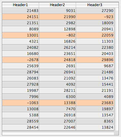
Next you want to color the cells with negative values in dark orange. To do this, you set a background color array for each column, for example <>_BgndColor_1, <>_BgndColor_2 and <>_BgndColor_3. The values of these arrays have priority over the ones set in the list box properties as well as those of the general background color array:
 <>_BgndColorsCol_3{2}:=0x00FF8000 // dark orange

 <>_BgndColorsCol_2{5}:=0x00FF8000

 <>_BgndColorsCol_1{9}:=0x00FF8000

 <>_BgndColorsCol_1{16}:=0x00FF8000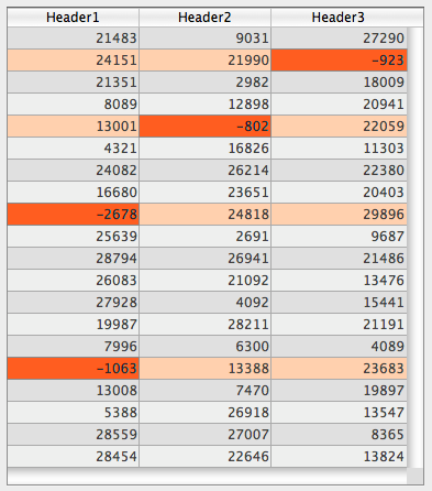
You can get the same result using the LISTBOX SET ROW FONT STYLE and LISTBOX SET ROW COLOR commands. They have the advantage of letting you skip having to predefine style/color arrays for the columns: instead they are created dynamically by the commands.
For each attribute (style, color and background color), an inheritance is implemented when the default value is used:
- for cell attributes: attribute values of rows
- for row attributes: attribute values of columns
- for column attributes: attribute values of the list box
This way, if you want an object to inherit the attribute value from a higher level, you can use pass the lk inherited constant (default value) to the definition command or directly in the element of the corresponding style/color array.
Given a list box containing a standard font style with alternating colors:
You perform the following modifications:
- change the background of row 2 to red using the Row Background Color Array property of the list box object,
- change the style of row 4 to italics using the Row Style Array property of the list box object,
- two elements in column 5 are changed to bold using the Row Style Array property of the column 5 object,
- the 2 elements for column 1 and 2 are changed to dark blue using the Row Background Color Array property for the column 1 and 2 objects:
To restore the original appearance of the list box, you can:
- pass the lk inherited constant in element 2 of the background color arrays for columns 1 and 2: then they inherit the red background color of the row.
- pass the lk inherited constant in elements 3 and 4 of the style array for column 5: then they inherit the standard style, except for element 4, which changes to italics as specified in the style array of the list box.
- pass the lk inherited constant in element 4 of the style array for the list box in order to remove the italics style.
- pass the lk inherited constant in element 2 of the background color array for the list box in order to restore the original alternating color of the list box.
You can set the "hidden", "disabled" and "selectable" interface properties for each row in an array-based list box.
These settings can be handled by the Row Control Array, which you can designate using the LISTBOX SET ARRAY command or through the Property list:
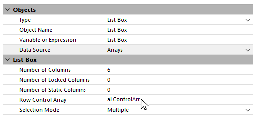
A row control array must be of the Longint type and include the same number of rows as the list box. For more information, refer to the List box specific properties section.
Each element of the Row Control Array array defines the interface status of its corresponding row in the list box. Three interface properties are available using constants in the "List Box" constant theme:
| Constant | Type | Value | Comment |
| lk row is disabled | Longint | 2 | The corresponding row is disabled. The text and controls such as check boxes are dimmed or grayed out. Enterable text input areas are no longer enterable. Default value: Enabled |
| lk row is hidden | Longint | 1 | The corresponding row is hidden. Hiding rows only affects the display of the list box. The hidden rows are still present in the arrays and can be managed by programming. The language commands, more particularly LISTBOX Get number of rows or LISTBOX GET CELL POSITION, do not take the displayed/hidden status of rows into account. For example, in a list box with 10 rows where the first 9 rows are hidden, LISTBOX Get number of rows returns 10. From the user’s point of view, the presence of hidden rows in a list box is not visibly discernible. Only visible rows can be selected (for example using the Select All command). Default value: Visible |
| lk row is not selectable | Longint | 4 | The corresponding row is not selectable (highlighting is not possible). Enterable text input areas are no longer enterable unless the "Single-Click Edit" option is enabled. Controls such as check boxes and lists are still functional however. This setting is ignored if the list box selection mode is "None". Default value: Selectable |
To change the status for a row, you just need to set the appropriate constant(s) to the corresponding array element. For example, if you do not want row #10 to be selectable, you can write:
aLControlArr{10}:=lk row is not selectable
You can define several interface properties at once:
aLControlArr{8}:=lk row is not selectable+lk row is disabled
Note that setting properties for an element overrides any other values for this element (if not reset). For example:
 aLControlArr{6}:=lk row is disabled+lk row is not selectable //sets row 6 as disabled AND not selectable

aLControlArr{6}:=lk row is disabled //sets row 6 as disabled but selectable againWhen the Hide selection highlight option is checked (see Appearance theme section), you need to make list box selections visible using available interface options. Since selections are still fully managed by 4D, this means:
- For array type list boxes, you must parse the Boolean array variable associated with the list box to determine which rows are selected or not.
- For selection type list boxes, you have to check whether the current record (row) belongs to the set specified in the Highlight Set property of the list box.
You can then define specific background colors, font colors and/or font styles by programming to customize the appearance of selected rows. This can be done using arrays or expressions, depending on the type of list box being displayed (see the following sections).
Note: You can use the lk inherited constant to mimic the current appearance of the list box (e.g., font color, background color, font style, etc.). For more information about how the lk inherited constant works, refer to the Inheritance description.
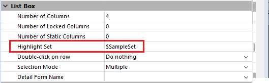
To determine which rows are selected, you have to check whether they are included in the set indicated in the Highlight Set property of the list box:
You can then define the appearance of selected rows using one or more of the following expressions specified in the Property List:
- Background Color Expression (Background and Border theme)
- Font Color Expression (Text theme)
- Style Expression (Text theme)
Note: Keep in mind that expressions are automatically re-evaluated each time the:
- list box selection changes.
- list box gets or loses the focus.
- form window containing the list box becomes, or ceases to be, the frontmost window.
Break rows cannot be highlighted when the Hide selection highlight option is checked.
Since it is not possible to have distinct colors for headers of the same level, there is no way to highlight a specific break row by programming.
You have to parse the Boolean array variable associated with the list box to determine whether rows are selected or not selected:
You can then define the appearance of selected rows using one or more of the following arrays specified in the Property List:
- Row Background Color Array (Background and Border theme)
- Row Font Color Array (Text theme)
- Row Style Array (Text theme)
Note that list box arrays used for defining the appearance of selected rows must be recalculated during the On Selection Change form event; however, you can also modify these arrays based on the following additional form events:
- On Getting Focus (list box property)
- On Losing Focus (list box property)
- On Activate (form property)
- On Deactivate (form property)
...depending on whether and how you want to visually represent changes of focus in selections.
You have chosen to hide the system highlight and want to display list box selections with a green background color, as shown here:
For an array type list box, you need to update the Row Background Color Array by programming:
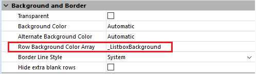
In the object method of the list box, you can write:
Case of
:(FORM Event=On Selection Change)
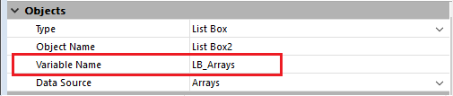
$n:=Size of array(LB_Arrays)
ARRAY LONGINT(_ListboxBackground;$n) // row background colors
For($i;1;$n)
If(LB_Arrays{$i}=True) // selected
_ListboxBackground{$i}:=0x0080C080 // green background
Else // not selected
_ListboxBackground{$i}:=lk inherited
End if
End for
End caseFor a selection type list box, to produce the same effect you can use a method to update the Background Color Expression based on the set specified in the Highlight Set property. For example:
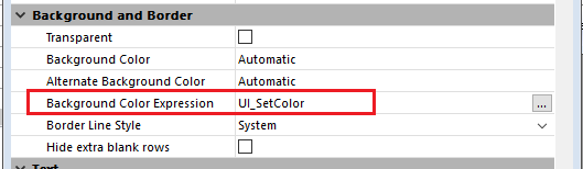
In the UI_SetColor method, you can write:
 If(Is in set("$SampleSet"))

    $color:=0x0080C080 // green background

 Else

    $color:=lk inherited

 End if


 $0:=$color
Warning: Do not forget to check the Hide selection highlight option to disable system highlight (see above).
It is possible to place the results of an SQL query directly in an array type list box. This offers a rapid means for viewing the results of SQL queries. Only queries of the SELECT type can be used. This mechanism cannot be used with an external SQL database.
It works according to the following principles:
- Create the list box which will receive the query results. The data source of the list box must be Arrays.
- Execute an SQL query of the SELECT type and assign the result to the variable associated with the list box. You can use the Begin SQL/End SQL keywords (see the 4D Language Reference manual).
- List box columns can be sorted or modified by the user.
- Each new execution of a SELECT query with the list box leads to the resetting of the columns (it is not possible to fill the same list box progressively using several SELECT queries).
- It is recommended to give the list box the same number of columns as there will be in the SQL query result. If the number of list box columns is less than that required by the SELECT query, columns are added automatically. If the number of columns is more than required by the SELECT query, the unnecessary columns are automatically hidden.
Note: The columns added automatically are bound to of the array type. These dynamic arrays last as long as the form does. A dynamic variable is also created for each header. When the LISTBOX GET ARRAYS command is called, the arrColVars parameter contains pointers to the dynamic arrays and the arrHeaderVars parameter contains pointers to the dynamic header variables. If the added column is, for example, the fifth column, its name is sql_column5 and its header name is sql_header5. - In interpreted mode, existing arrays that are used by the list box can be retyped automatically according to the data sent by the SQL query.
Example
We want to retrieve all the fields of the PEOPLE table and put their contents into the list box having the variable name vlistbox. In the object method of a button (for example), simply write:
 Begin SQL

    SELECT * FROM PEOPLE INTO <<vlistbox>>

 End SQL
Customize Highlight Color (4D blog)
Download HDI database
Tutoriaux sur les list box

Product: 4D
Theme: List Box
Modified: 4D v15 R4
Modified: 4D v16 R2
Modified: 4D v17
4D Language Reference ( 4D v20 R7)


