
This is the legacy 4D documentation web site. Documentations are progressively being moved to developer.4d.com
- 4D Design Reference
-
- Working with active objects
-
-
 What are active objects?
-
 Field and variable objects
-
Buttons
-
3D Buttons, 3D Check Boxes and 3D Radio Buttons
-
Picture Buttons
-
Button Grids
-
Check Boxes
-
Radio Buttons and Picture Radio Buttons
-
Pop-up Menus/Drop-down Lists
-
Combo Boxes
-
Hierarchical Pop-up Menus and Hierarchical Lists
-
Picture Pop-up Menus
-
Indicators
-
Tab Controls
-
Splitters
-
Web areas
-
Plug-in areas
-
List boxes
-
Subforms
-
Buttons
The Form editor lets you add a wide variety of buttons to your forms. When you add buttons to a form, you can associate a standard action with each button. Buttons with standard action let the user accept, cancel, or delete records, move between records, move from page to page in a multi-page form, open, delete, or add records in a subform, handle font attributes in text areas, etc.
You normally add buttons when you create the form using the Form Wizard. You can modify these buttons’ actions in the Property List. For example, you can remove a standard action from a button and write an object method that specifies the button’s action.
You can also add buttons and assign button actions with the Form editor. For example, if you need more than one subform on the form, you can add the necessary additional subforms and automatic buttons in the Form editor. You simply add each button to the form and associate a standard action with each one.
4D lets you use the following types of buttons:
- Buttons: These buttons are displayed in the current platform interface. Button text is displayed in the selected font, font size, style, and color.
The label displayed by the button is set in the Title field of the “Objects” theme in the Property List. You can change it at any time:
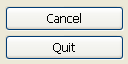
- Default Buttons: A default button is similar to a standard button except that it has a modified appearance, which intends to indicate the recommended choice to the user. The difference depends on the OS. The following illustration compares a button to a default button on Windows:
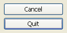
Under macOS, the default buttons are blue:
The Default button object type does not exist as such but it is a property that is available for buttons.
Note: There can only be one Default button per form page.
- Invisible buttons: These buttons are designed to be placed on top of graphic objects. Invisible buttons remain invisible and do not highlight when clicked. It is the resulting action, such as the display of a different page, which indicates that the button has been clicked. You place an invisible button on top of text or a graphic that denotes its function; then the user clicks on the text or graphic, and the button is activated.
- Highlight buttons
Compatibility Note: Highlight button form objects do not comply with modern interface requirements and are deprecated started with 4D v17 R3. They should no longer be used. They are not supported in Dynamic Forms.
These buttons are designed to be placed on top of graphic objects. Highlight buttons are transparent. When the user clicks a highlight button, the graphics of the button are highlighted.
- 3D buttons and Picture buttons: The family of 3D buttons (3D buttons, 3D check boxes, and 3D radio buttons) and picture buttons include numerous specific properties. These buttons are described in the sections 3D Buttons, 3D Check Boxes and 3D Radio Buttons and Picture Buttons.
Buttons with standard actions are dimmed when appropriate during form execution. For example, if the first record of a table were displayed, a button with the firstRecord standard action would appear dimmed.
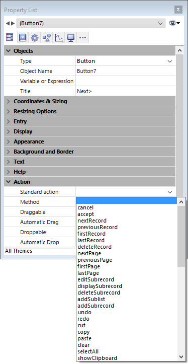
You create a button by choosing the desired button type from the Type drop-down list. You then select or write the standard button action you want from the Standard action list (for more information, refer to section Standard actions):
If you want the button to perform an action not available as a standard action, left the Standard action field empty and write an object method that specifies the button’s action (see Editing methods).
Normally, you would activate the On Clicked event in the Events theme and the method would run only when the button is clicked. You can associate a method with any button.
All variables associated with buttons (including regular buttons, highlight buttons, invisible buttons, radio buttons, picture radio buttons and check boxes) are set to 0 when the form is executed for the first time in Design or Application mode. When the user clicks a button, its variable is set to 1.
For a description of each action, see the Standard actions section.
3D Buttons, 3D Check Boxes and 3D Radio Buttons
Picture Buttons
Standard actions

Product: 4D
Theme: Working with active objects
4D Design Reference ( 4D v20 R7)


